LE 4 domain switching user ratio
+8.59%
서비스 구축
Role: UX Design, Research
Today’s Home has been a ‘feed for discovering inspiration’ for a long time. However, as Today's House's corporate strategy changed in 2026, this definition had to be rewritten.
The strategy was narrowed down to ‘optimizing the journey of key customers who have the greatest cumulative value created while a customer is with Today’s House.’ The core customers** were people who needed to move or do home styling within a month. These are people who process the largest decisions, including construction, furniture, and household goods purchases, in one cycle**.
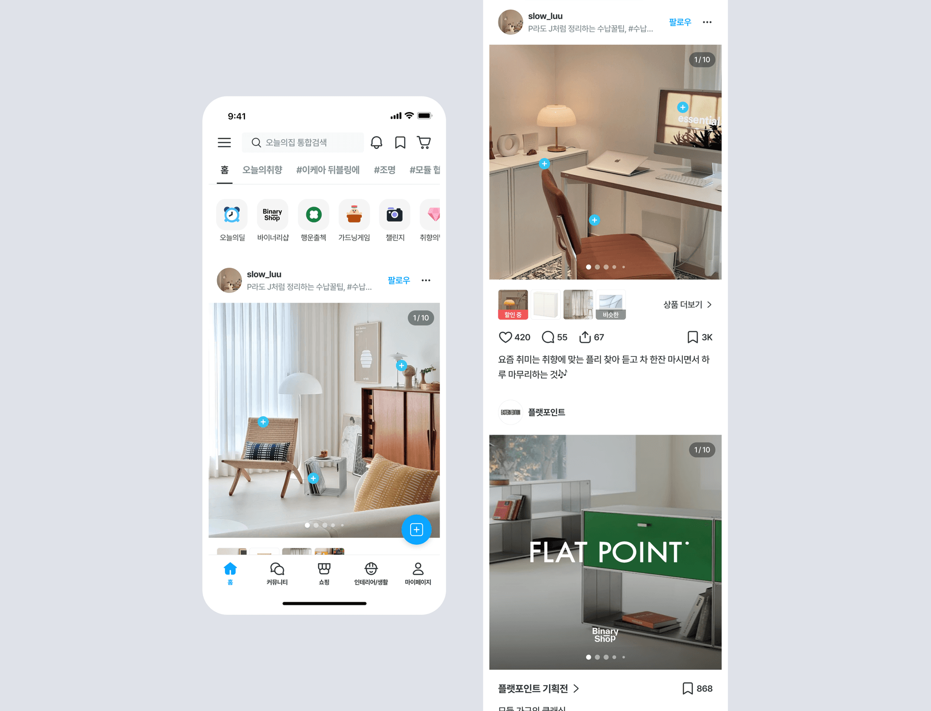
The first screen they reach is the home screen. So Home becomes the starting point for your exploration journey. This project aimed to change the 'endless browsing inspiration feed', which was the main experience of the existing home, into 'a navigation home that quickly guides you to the next navigation route appropriate for your situation.' Customer interests, searches,The home screen structure has been redesigned so that you can quickly catch inquiry signals and continue your next navigation journey.
The core users of this product are highly involved users who are about a month away from moving or construction. As we face a high-cost, high-involvement decision, we cross-search a wide range of information such as guides, cases, products, and reviews, and go to interior design cafes, YouTube, and even offline stores to gather information.
The essence of the problem they were experiencing was not a lack of information, but ‘the absence of curation tailored to my situation.’ The existing home already showed personalized content with more than 30,000 case contents labeled by square footage, space, and style, as well as a product database for each category. However, the feed structure, which infinitely shows content similar to searched and viewed keywords, was effective in expanding the scope of inspiration, but had clear limitations for highly involved users with a clear decision-making stage.
When a user searches for 'sofa', there are endless photos of sofas and examples of living rooms in similar tones, and at this stage,No one told me what to look at next or how to narrow down which decision to make. As a result, core customers who needed specific information to make a decision faster were unable to find answers within the app and left the app to external communities or YouTube, resulting in navigational fatigue.
Actual user feedback also pointed to the same point.
"When you turn on the app, there is a lot of information and menus, so it can be confusing to know where to press at first. I hope the screen is organized in a simpler and more intuitive way, focusing on frequently used functions."
"There is a lot of content and it is good for reference, but because there are so many options, it is often difficult to make a decision. If you organize them by spaces with similar conditions or purpose of use, you will spend less time worrying and more usable."
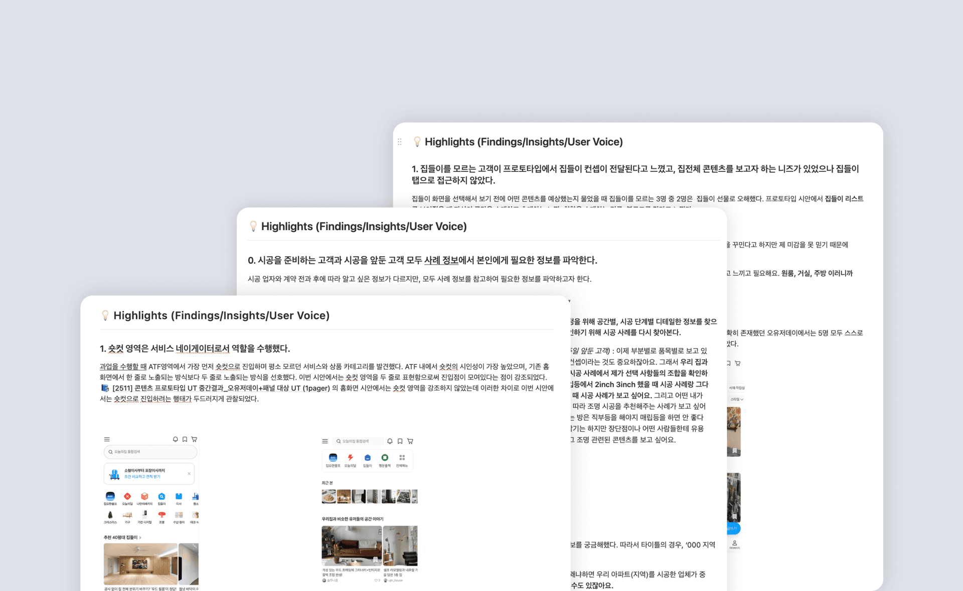
Based on the time of moving, we analyzed changes in residence time, multiple viewing pages, and commerce indicators from 3 months before moving to the current month. In fact, when we looked at app usage patterns before and after moving among 20,761 moving users in October 2025, we found a clear pattern in which app usage rapidly increased about 2-3 months before moving, the stay time peaked at the time of moving, and then rapidly decreased after moving was completed. The event of moving was a strong trigger to use the app.
Users' browsing behavior was mapped out in clear stages centered around the time of moving.
Stage 1. Interior concept exploration (2-3 months before moving):
Housewarming and content have the highest proportion, and the macroscopic space structure and atmosphere are explored.
Stage 2. Product exploration and actual purchase (1 month before moving to current month):
Product details: Land stay ratio is 30%Once it reaches its peak, the frequency of shopping cart actions increases and actual purchase decisions begin in earnest.
Purchasing behavior was not an immediate purchase, but a planned consumption pattern of Explore > Scrap > Shopping Cart > Purchase. The structure was to narrow down the candidate group after looking at enough cases, and then proceed to payment only after reviewing the shopping cart one more time. Through this, we also confirmed that reviews and styling information, which provide confidence before payment, are key variables in purchasing decisions. After moving, the items purchased changed from furniture to low-cost household items.
Users clearly needed different information depending on the timing of their move. So shouldn’t Home also curate step-by-step navigation to follow this trend?
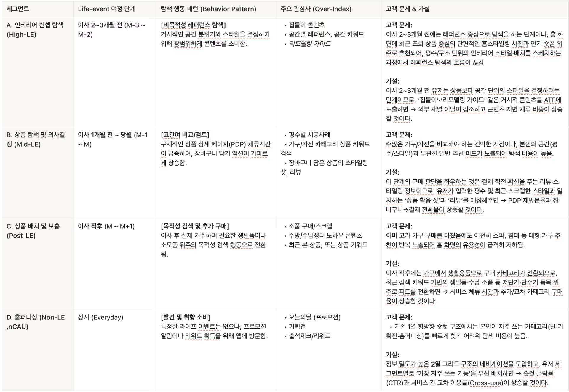
Based on this analysis, we redesigned the bottom feed area of the homepage into a content and product module that actively responds to the user's decision-making stage. We divided users into four segments according to their life event stages, and designed separate problems and solutions for each segment.
A. Interior concept exploration (High-LE, 2-3 months before moving):
At this stage, the user is trying to decide on the style of the space unit. However, Home only recommended fragmentary home styling photos centered on recently viewed products and popular short forms, so the flow of reference search kept getting interrupted in the process of sketching the interior style and layout by square footage and structure.
Hypothesis: Since we are at the stage of determining the style of space rather than product, exposing macro content such as ‘housewarming’ and ‘remodeling guide’ at the top of the screen (ATF) will reduce the likelihood of leaving external channels.As the content decreases, the proportion of stays will increase.
Solution: Personalized case module that curates step-by-step guide content from construction examples of the same apartment complex based on user profile and address information. By adding construction guidebook content that processes know-how and material data for each stage of construction, the search for expert knowledge that had been directed to external communities (Sellin Cafe, etc.) was brought into the service.
B. Product exploration and decision-making (Mid-LE, 1 month before moving to current month):
It is an urgent time to compare numerous furniture and home appliances, but search costs were high because general recommendation feeds that were unrelated to one's space (square footage and style) were exposed.
Hypothesis: What determines the purchase decision at this stage is the review and styling information that provides confidence just before payment, so it matches the rating entered by the user and the recently scraped style.Matching ‘product usage shots’ and ‘reviews’ will increase the PDP revisit rate and shopping cart → payment conversion rate.
Solution: An information collection expansion module that reflects the user's taste signals and recommends housewarming by platform and photos and videos by space, and matches the products in the shopping cart with review content placed in the actual space. We minimized the purchase search path by recommending similar products based on recently searched and viewed product data.
The hypothesis was not handed over to development as is. Over a two-month period, we met and interviewed about 40 users from three segments.
Hi-Fi Prototype UT
To increase actual immersion, we used AI tools such as Cursor to create a hi-fi mock-up prototype that linked Redash-based customer interest data with the actual product API and content API. Because the screen was constructed with actual customer's personalized data, we were able to verify whether the hypothesis established for each life event stage was actually perceived by the customer as valid.
Main Segment Division
Home styling, construction preparation users (High-LE): There was an overwhelmingly positive response to the AI-curated ‘remodeling guide’ and ‘material information’ rather than a simple product listing. External community (Cell in Cafe) for information explorationThe content I was looking for was received positively from the construction guidebook content within Today's House service.
User imminent to purchase (Mid-LE): When 'construction examples' and 'product usage shots' that reflect the user's square footage and style signal were exposed, they were retained and responded positively to continue the search.
Constant navigation users (Non-LE): The majority of responses said that it was easier to navigate the desired service menu in the two-column grid structure with increased information density. As the menu increased, there were no negative reactions, such as the complexity issues that the team was concerned about.
01 Recommended bundles of similar products based on recent search/view categories:
In line with the mental model that “search is a problem that must be solved immediately,” we believed that immediately exposing product groups linked to search terms would maximize search efficiency and purchase conversion (CVR).
02 Styling shot using shopping cart/viewed products:
We believed that showing actual use cases (context) to users who are concerned about the placement of specific furniture would resolve uncertainty in decision-making and give them confidence in purchasing.
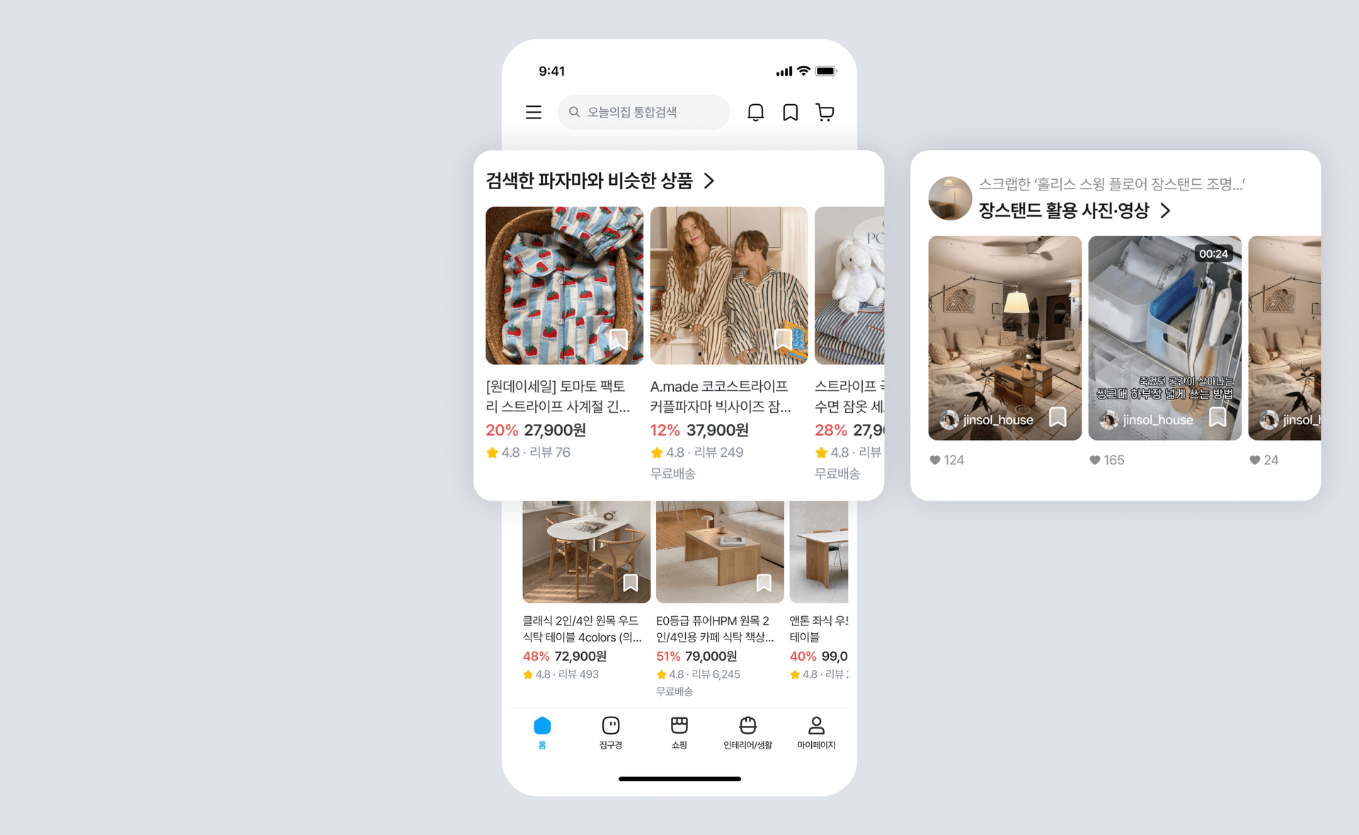
03 Photos and videos by space:
We hoped to increase overall stay time by stimulating the ‘joy of discovery’ with image-centered visual information.
04 Customized housewarming recommendations by square footage:
I thought that ‘houses similar to mine’ data was the strongest trust indicator, and that connecting it with the ATF dashboard would strengthen service lock-in.
05: Construction Guidebook:
By capturing user behavior patterns that were leaving the external community, we processed and provided know-how and material data for each stage of construction. To secure platform expertise and lead to a natural cross-sell to high-cost services such as construction and moving.
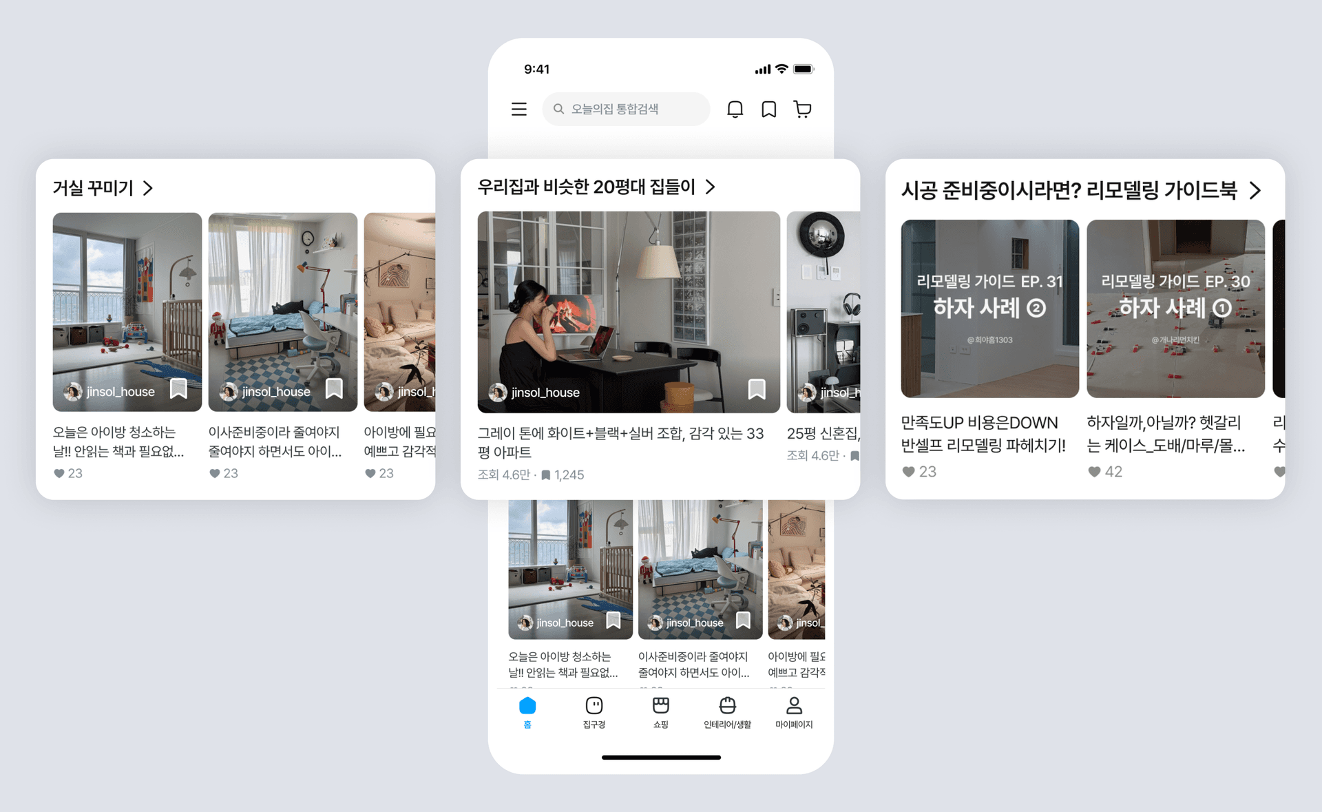
Shortcuts and banners are not simply personalization, but are designed as a hybrid system that balances the platform's business goals and the user's current context.
By dividing the shortcut structure into fixed and floating slots, we strengthened the navigation role by recommending services with a high click probability for each user segment in real time while maintaining a structure that allows flexible operation of advertising and big seasonal promotions.
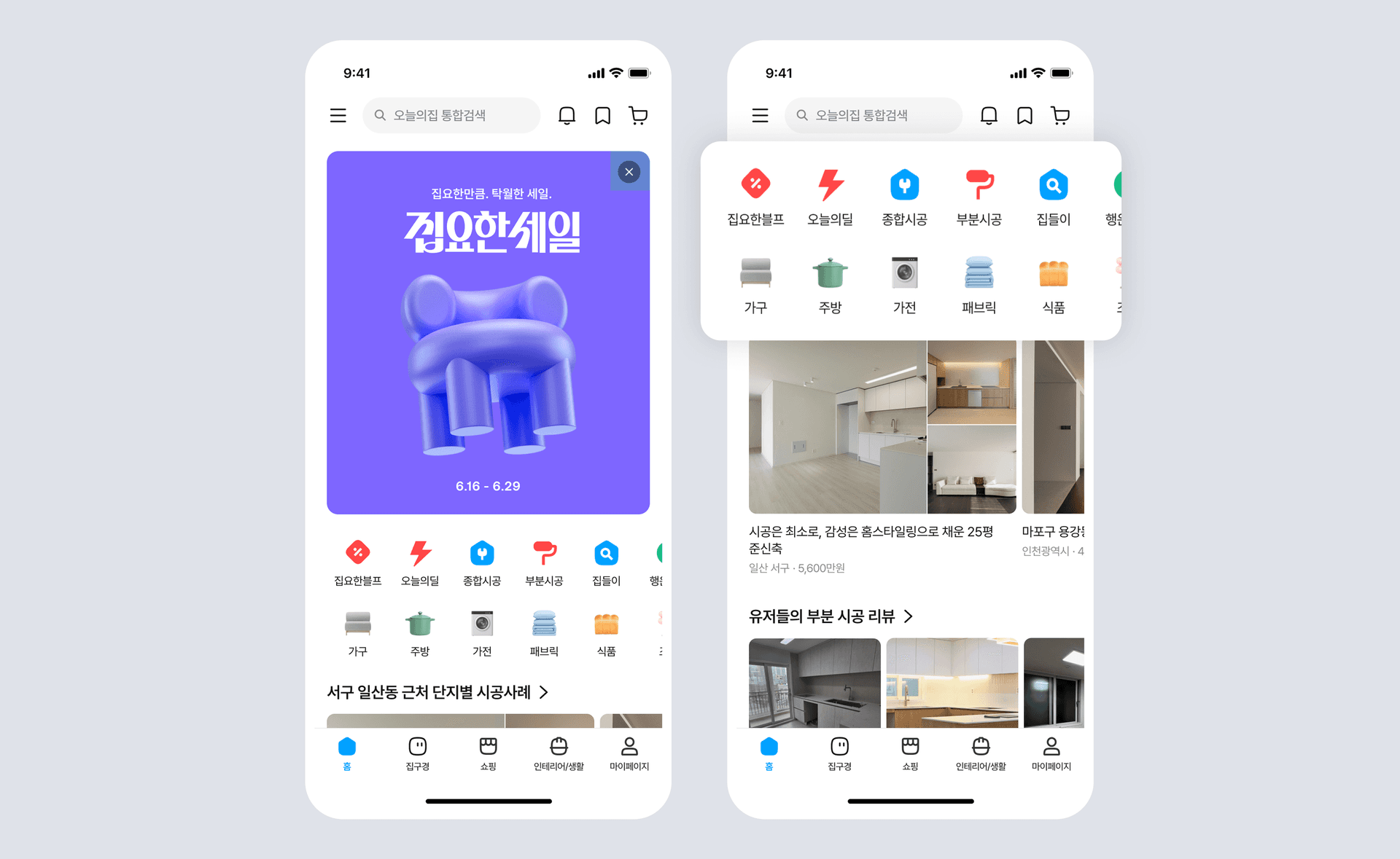
With real data-linked prototypes, we were able to detect design risks early and elaborate detailed policies based on data before development and implementation. We also verified that the step-by-step widget and intent-based module placement is not just convenience, but a ‘strategic navigator’ that induces the transition to high-cost services (e.g. construction).
The key achievement of this project is the definition of a ‘cross-exploration indicator’ as OMTM (One Metric That Matters). By allowing one user to cross two or more domains such as Content, Commerce, and Construction at home, we have secured leading indicators that can drive the user's lock-in effect and increase in average revenue per person.
LE 4 domain switching user ratio
+8.59%
buyer conversion rate
+1.04%
*Significant increase (p=0.025)
total profit
+2.30%
*(p=0.205)


