Proportion of content with product tags among new content
90%
*Achieved a new point
feature release
Role: UX Design, Research

In order to expand beyond the interior vertical to the overall lifestyle, the content team focused on operational actions that encourage recording of various daily topics other than home and space. Thanks to boost strategies such as events and cash rewards, content production increased by 52% compared to the previous year.
However, inducing production centered on temporary rewards led to a decline in content quality. In terms of inquiries, negative customer VOC also increased. To solve this problem, we redefined Today's House's PMF (Product-Market Fit) content and started an upload funnel improvement project to improve key quality indicators such as product tag entry rate, image quality, and text length.
Persistent low-quality recommendations were driving down content quality. Customer VOC increasingly reflected this, with direct complaints such as "low-quality content gets recommended too often."
To address this, we started with the PO and DA team by asking a single question: what actually makes content "quality" content? From there, we worked together to define how that quality should be measured.
Until then, the team had operated on an implicit consensus that good content meant high-aesthetic images or well-styled, moody photos of a space. But this assumption had never been validated against what users actually sought out and stayed on.
The data told a different story. Analyzing high-performing content — content with above-average dwell time relative to views, and content that also drove cross-sell (purchase conversion) — showed that the content users responded to most wasn't simply visually striking. It combined product tags, clear and appropriately zoomed-in images, and positive reviews.
INSIGHT💡 We redefined content quality — not as how beautiful is it, but as how much useful information does it carry.
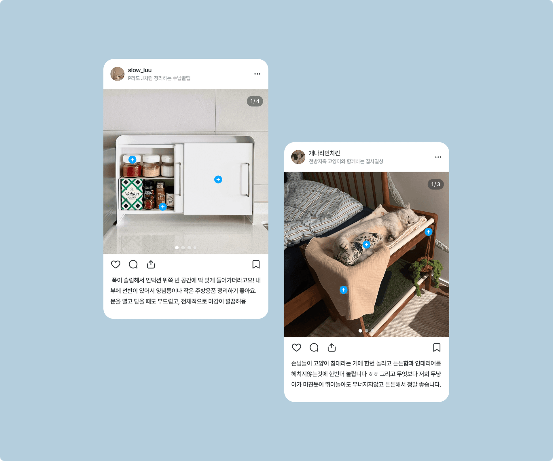
So the direction for the solution became clear: make it far easier for customers to include this "useful information" — product tags, zoomed-in shots, reviews — than it currently was.
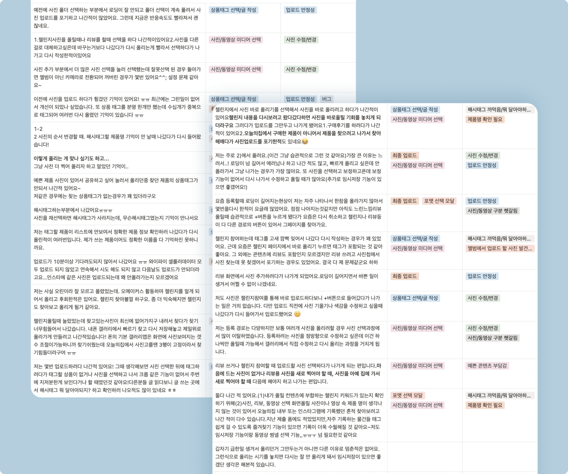
The first thing we needed to pin down was exactly where customers were getting stuck while entering this information. We ran a survey with a panel, and the main pain points were these.
a. It's cumbersome to go back and forth between editing apps to correct photos.
b. It's annoying to search and enter the same product every time.
c. It is difficult to distinguish between photos taken from various angles in my album.
d. I don't think there's a proper sorting option for the picture of the bowl.
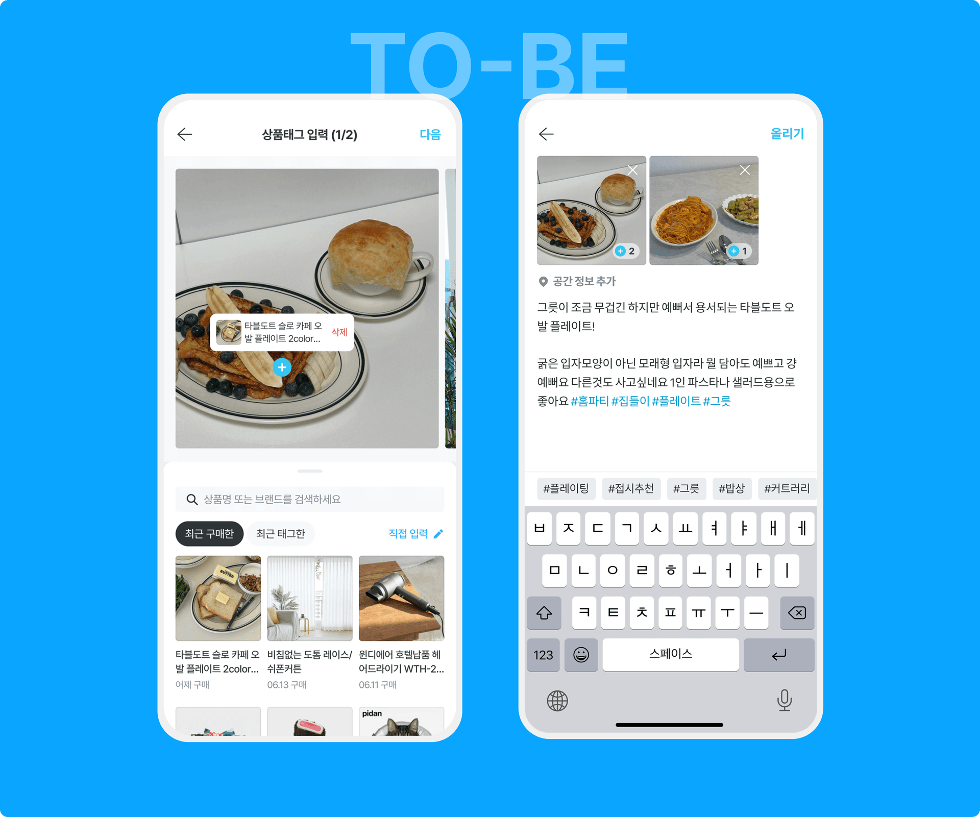
1. One-click input of product tag:
The idea was that most users who uploaded content more than once entered duplicate product tags. It retrieves a list of recently tagged or purchased products and allows you to enter product information with one click.
2. Improved body writing usability
To increase the convenience of writing the text, the description input area has been expanded. By entering hashtags and recommending related hashtags using inline text, we improved input usability as an auxiliary method to improve content classification and recommendation accuracy.
Improvements to the upload funnel to improve content quality were rolled out in stages over several sprints. We received positive user feedback regarding the UX that reduced repetitive input.
Proportion of content with product tags among new content
90%
*Achieved a new point
Average number of product tags per content: 5
4 > 5
*Achieved a new point
2026

2026
april, 2026
Nov. 2024

Mar. 2024
2026